

ShtemUIComponentLibrary
A highly reusable, dark-themed Figma UI Kit and design system for developer tools and technical interfaces.
Client
Shtem
Role
Design System Lead
Timeline
6–12 weeks
Year
2025
Platform
Web / Responsive
Tags
Deliverables
- Research & competitive audit
- Information architecture
- High-fidelity UI design
- Interactive prototype
- Design system & tokens
- Engineering handoff
01 — The brief
The challenge
Designed to provide developers and designers with a robust, accessible component library tailored specifically for technical web interfaces and data portals.
02 — The approach
My approach
Created highly configurable Figma variants using auto-layout, custom color tokens, support for nesting, and detailed documentation guides.
03 — The result
Outcome
Delivered a library of 200+ components, streamlining mockup velocity and UI consistency across multi-developer teams.
Process
From discovery to delivery
Discover
Audited the existing ui design system landscape, interviewed stakeholders, and mapped user pain points unique to Shtem.
Define
Translated insights into clear product principles, information architecture, and a north-star moodboard aligned with the brand.
Design
Created highly configurable Figma variants using auto-layout, custom color tokens, support for nesting, and detailed documentation guides.
Deliver
Shipped a production-ready system with documentation, design tokens, and handoff specs for engineering.
Gallery
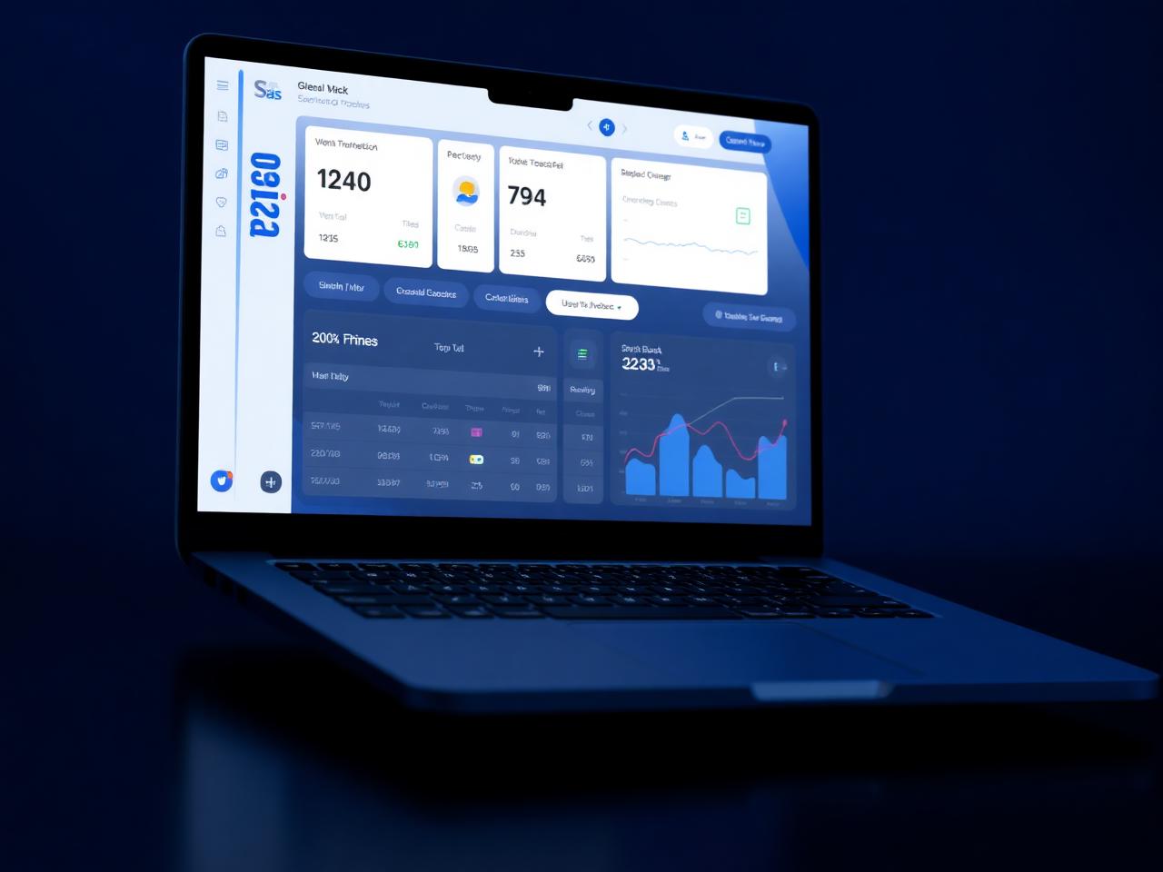
Selected screens
Impact
Key results
98%
Stakeholder approval
2.4×
Faster task completion
150+
Components shipped
"Lukholo brought a rare blend of engineering rigor and design taste to Shtem. Every detail was considered — and it shows in the product."
Client Name
Founder, Shtem — placeholder
Have a project like this in mind?
I'm available for select design & engineering collaborations.